Plot panel
Plot values from topic message paths which point to numeric fields.
Settings
General
| field | description |
|---|---|
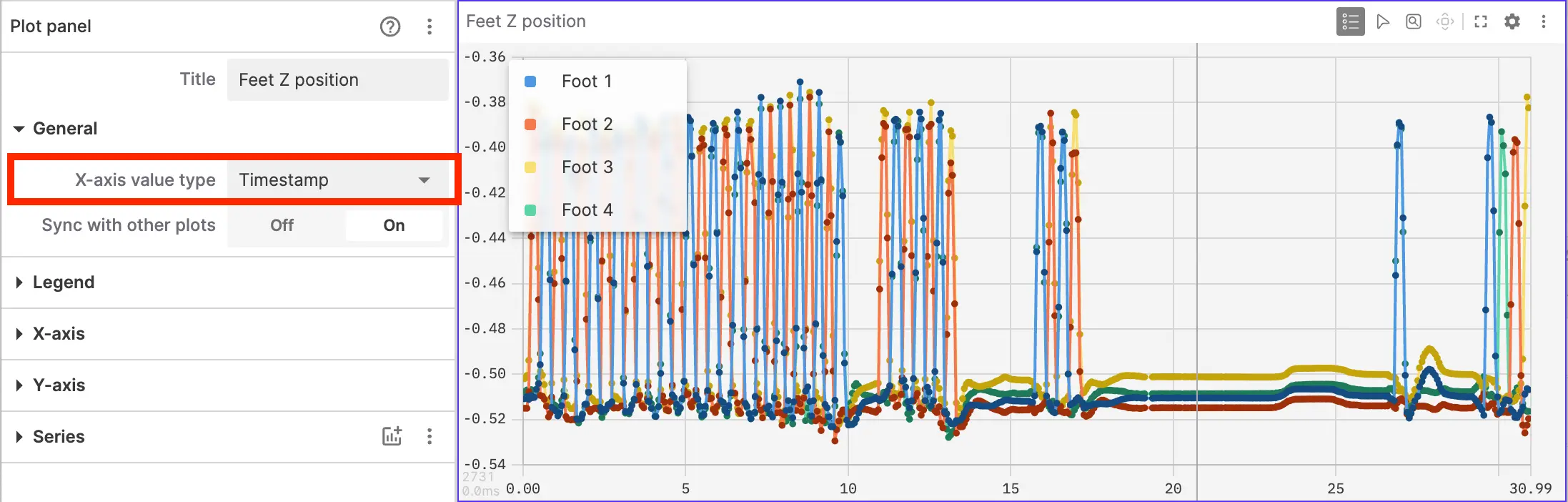
| X-axis value type | Type and source of data for values plotted on the x-axis:
|
| Sync with other plots | For Timestamp plots: Sync timeline to other Plot and State Transitions panels. |
| Time range | For Message path plots:
|
| Axis scales | For Message path plots:
|
Time series plots
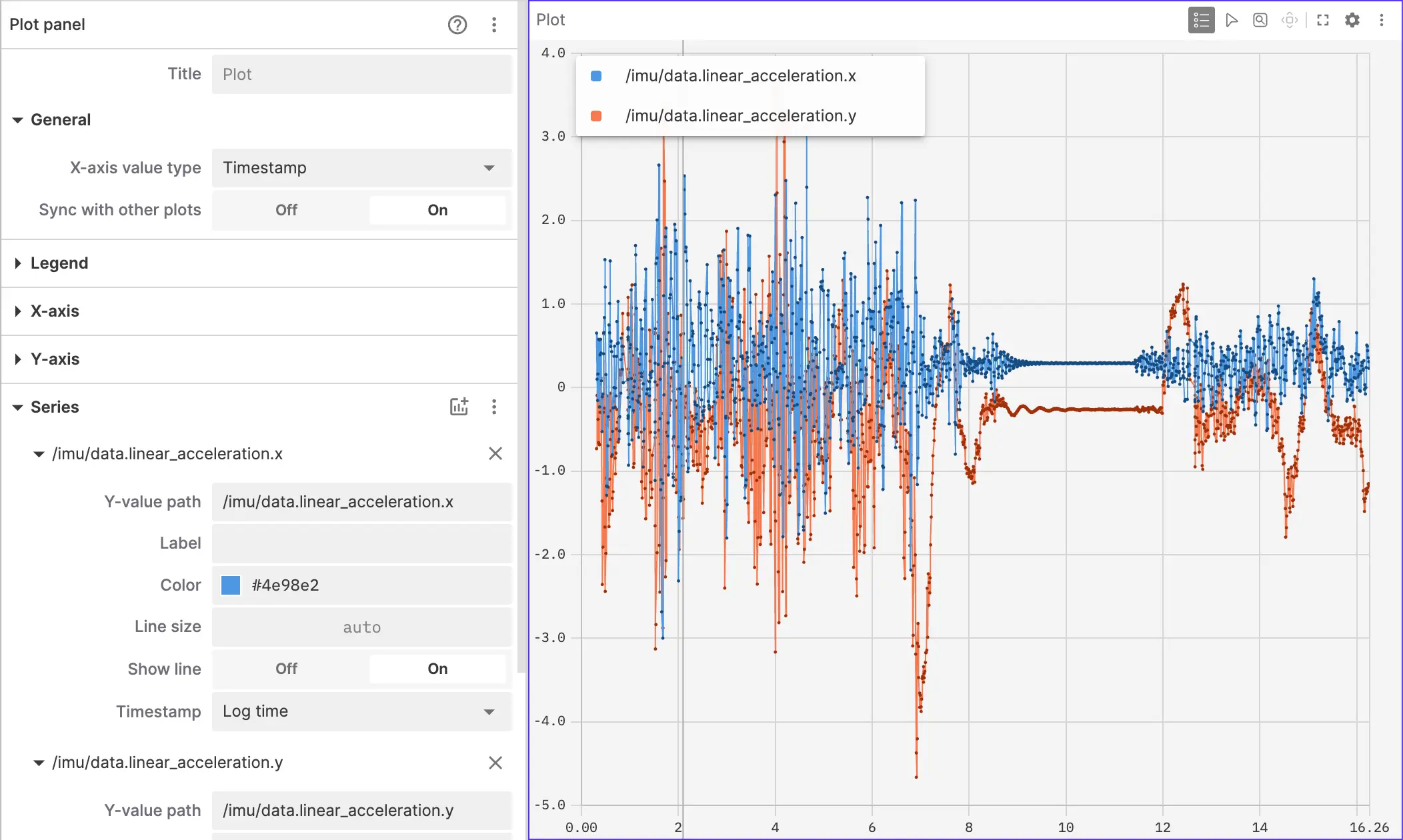
The default Timestamp option for the x-axis value type plots y-values against messages timestamps. The zoom state of time series Plot and State Transitions panels in a given layout can be kept in sync for easy comparison.
Current playback time is indicated by a vertical gray bar.
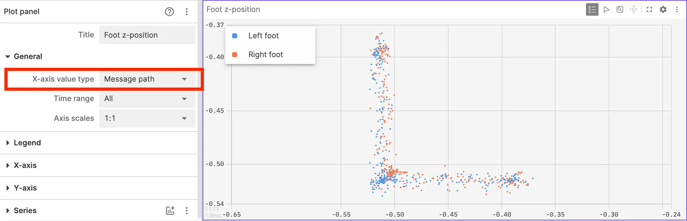
Path-based XY plots
The Message path mode produces XY scatter and trajectory plots where both y-values and x-values are extracted from message paths. You can specify x-values either per-series, or set a default for all series. The path can point to a single value or an array of values in the message.
The "Data range" setting controls which messages are plotted.
Index-based plots
The Array index mode plots instantaneous data from an array in the latest playback message using the array's index as the x-axis value. For example, if /some_topic.some_array contained the values [5, 10, 15] in a particular message, the resulting points on the chart would be [0, 5], [1, 10], and [2, 15] at that point in time.

Legend
| field | description |
|---|---|
| Position | Position of the legend in relation to the chart (Floating, Left, Top) |
| Floating position | Top left, Top right, Bottom left, or Bottom right |
| Show legend | Display the legend |
| Show values | Show the corresponding y value next to each series in the legend (either at the current playback time or at a point on user hover) |
When the secondary y-axis is enabled, legend rows are grouped by axis. Group headers use the configured axis labels, or Primary and Secondary when no custom labels are set.
X-axis
| field | description |
|---|---|
| Default values path | For path-based values: the message path containing default x-axis values for the series. You can also set these individually for each series. |
| Axis label | Label displayed for the x-axis |
| Show tick labels | Whether or not to display numeric values for x-axis tick marks |
| Timestamp format | For Timestamp plots:
|
| Time window | For Timestamp plots:
|
| Window size | For Sliding time window: range of time in seconds |
| Playhead position | For Sliding time window: either at the center or the right edge |
| Min | For Fixed time window: min value in seconds |
| Max | For Fixed time window: max value in seconds |
Y-axis
The primary y-axis is always present. Turn on Secondary axis to show a second y-axis for selected series. Turn it off to remove the secondary axis and return its series to the primary axis.
Secondary y-axes are not available when Axis scales is set to 1:1; switch to Independent axis scales before enabling one. The Axis scales control is shown for Message path plots.
When a secondary y-axis is enabled, the primary and secondary y-axis settings appear as expandable Primary and Secondary subsections. A custom Axis label is used as the subsection title when set.
| field | description |
|---|---|
| Axis label | Label displayed for the y-axis |
| Show tick labels | Whether or not to display numeric values for y-axis tick marks |
| Show grid lines | Whether or not to display horizontal grid lines for the y-axis |
| Min | Fixed minimum value for y-axis |
| Max | Fixed maximum value for y-axis |
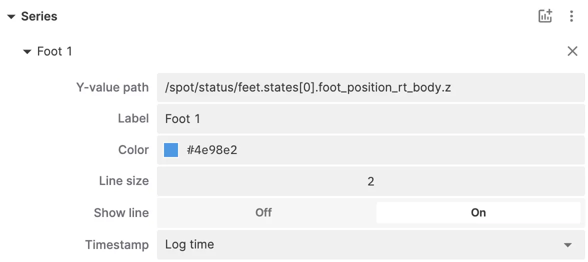
Series
| field | description |
|---|---|
| Label | Label displayed for the series in the legend |
| X-value path | For Message path plots: message path containing x-axis values for the series. Overrides default x-axis values if set. |
| Y-value path | Message path containing y-axis values for the series. When the path resolves to an array of objects, the panel can render dynamic sub-series — one line per distinct label. |
| Label field | For dynamic series: field name on each array element used as the sub-series name in the legend. Defaults to label. Shown when the y-value path targets a dynamic array. |
| Value field | For dynamic series: field name on each array element containing the plotted y-value. Defaults to value. Shown when the y-value path targets a dynamic array. |
| Color | Color used to plot the series |
| Line size | Width of line connecting data points |
| Show line | Show line connecting data points. (Not applicable to reference lines.) |
| Timestamp | For Timestamp plots, set which source of time information is used for message ordering:
|
Use the panel settings to add, edit, remove, or reorder data series:
Drag a series to a new position or use its action menu to move it up or down. Reordering changes the series order in the settings and plot legend while preserving the color associated with each series. When the secondary y-axis is enabled, drag series between the Primary and Secondary groups to choose which axis they use.
Enter the field or slice of data you would like plotted on the y-axis using message path syntax as a Series.
If you enter a message path that points to multiple values (for example, /some_topic/some_array[:].x), the plot will display multiple values each x-axis tick.
Toolbar buttons
Toggle legend
Hide and show the plot legend:
Point inspection
You can highlight two points on the chart and measure the distance between them using the Inspection tool in the panel toolbar. The point values and the distances between them along each axis are shown in place of the legend:
Press Esc to deselect any selected points. Press it again to turn off the inspection tool.
For path-based XY plots, the inspection tool will also display the straight-line (hypotenuse) distance between selected points.
Zoom tool
The zoom tool allows you to precisely specify a region of the plot to zoom in on. Press the button in the toolbar or press z on your keyboard to enable it.
You can use Alt/Option and Shift to specify the x- and y-axis, respectively:
Reset view
Reset the plot to the original viewport, as defined by your panel's range settings:
Controls and shortcuts
Pan and zoom
- To pan, click and drag using the mouse or trackpad.
- To zoom, scroll using the mouse wheel or trackpad, or use the Zoom tool as described above.
- Click the Reset view button, press
r(when the panel is selected), or double-click the panel to reset to the original viewport.
By default, path-based XY plots will zoom both axes simultaneously, while time series and index-based plots will zoom just the x-axis:
Path-based XY plots with 1:1 axis scales enabled will always zoom both axes simultaneously.
Zoom each axis independently by hovering over the target axis while scrolling with the mouse wheel or trackpad.
You can also use keyboard modifiers to control zoom behavior while scrolling or using the Zoom tool:
- Y-axis only, hold
Shift - X-axis only, hold:
Alt(Windows and Linux)Option(macOS)
- Both axes, hold:
Shift+Alt(Windows and Linux)Shift+Option(macOS)
Click-to-seek
Hover over any point on the plot to see its details in a tooltip. You'll see a vertical yellow bar appear, as well as a corresponding yellow marker at the same on the playback timeline. Click to seek playback to the yellow marker on the timeline.
Only available for recorded data.
Most recent values
For timestamp plots, the hover tooltip shows a value for every visible series even when a series has no sample exactly at the cursor: those series fall back to their most recent sample at or before the cursor, which makes it easy to compare values across multi-rate or sparse signals.
These latched values are shown in a muted color and annotated with how long before the cursor each sample is, for example 1.234 (0.4s ago), to set them apart from samples that exist at the cursor. This applies to the tooltip only.
When the legend's Show values option is enabled, the legend shows live hit values while the cursor is on a sample. If the cursor is between samples, the legend continues to show playback-time values.
Download CSV data
Right-click the plot to download the plotted data as a .csv file.
Message path functions
All message path functions are supported in the Plot panel, including time-series functions when using timestamp as the x-axis. Append functions to message paths using .@name syntax. See the message path function reference for the full list and descriptions.
Time-series functions (.@delta, .@derivative, .@timedelta) are available only when using timestamp as the x-axis (Log time, custom timestamp, etc.). They don't work with index-based or path-based x-axis plots.
For time-series modifiers:
.@deltaplots the change in y-value between consecutive samples (y[n] - y[n-1])..@derivativeplots the rate of change in y-value (`(y[n] - y[n-1]) / (t[n]- t[n-1])`).
.@timedeltaplots elapsed time in seconds between consecutive samples (t[n] - t[n-1]).
For .@derivative and .@timedelta, t comes from the series' Timestamp setting (for example, Log time, ROS header stamp, Publish time, or Custom field timestamp path).
When a message path includes filters, time-series modifiers use consecutive samples that match the filter. For example, /imu{sensor_id==3}.@timedelta uses the elapsed time between successive /imu messages where sensor_id is 3 (see @timedelta).
Time-series functions can be followed by scalar functions, but only one time-series function can appear in a chain:
- Valid:
/foo.value.@derivative.@abs - Valid:
/foo.value.@delta.@negative - Invalid:
/foo.value.@derivative.@derivative - Invalid:
/foo.value.@derivative.@norm
See JavaScript Math for details on the corresponding built-in math functions.
The operand functions .@add(number), .@sub(number), .@div(number), and .@mul(number) accept a single numeric operand. These numeric values can also be passed in via variable reference.
.@norm computes the Euclidean norm (magnitude) of a 2D or 3D vector object
with x, y (and optionally z) numeric properties, or of any numeric array:
/imu.linear_acceleration.@norm
/gps.velocity.@norm
/joint_states.velocity.@norm
.@rpy and .@quat are struct conversion functions using
XYZ Euler order (intrinsic rotations):
.@rpyconverts quaternion fields (x,y,z,w) toroll,pitch, andyawvalues in radians (rotations around X, Y, and Z axes respectively)..@quatconvertsroll,pitch, andyawfields (radians) to quaternionx,y,z, andw, as the inverse of.@rpy.
In Plot, use field access after .@rpy or .@quat to select a numeric value:
Reference lines
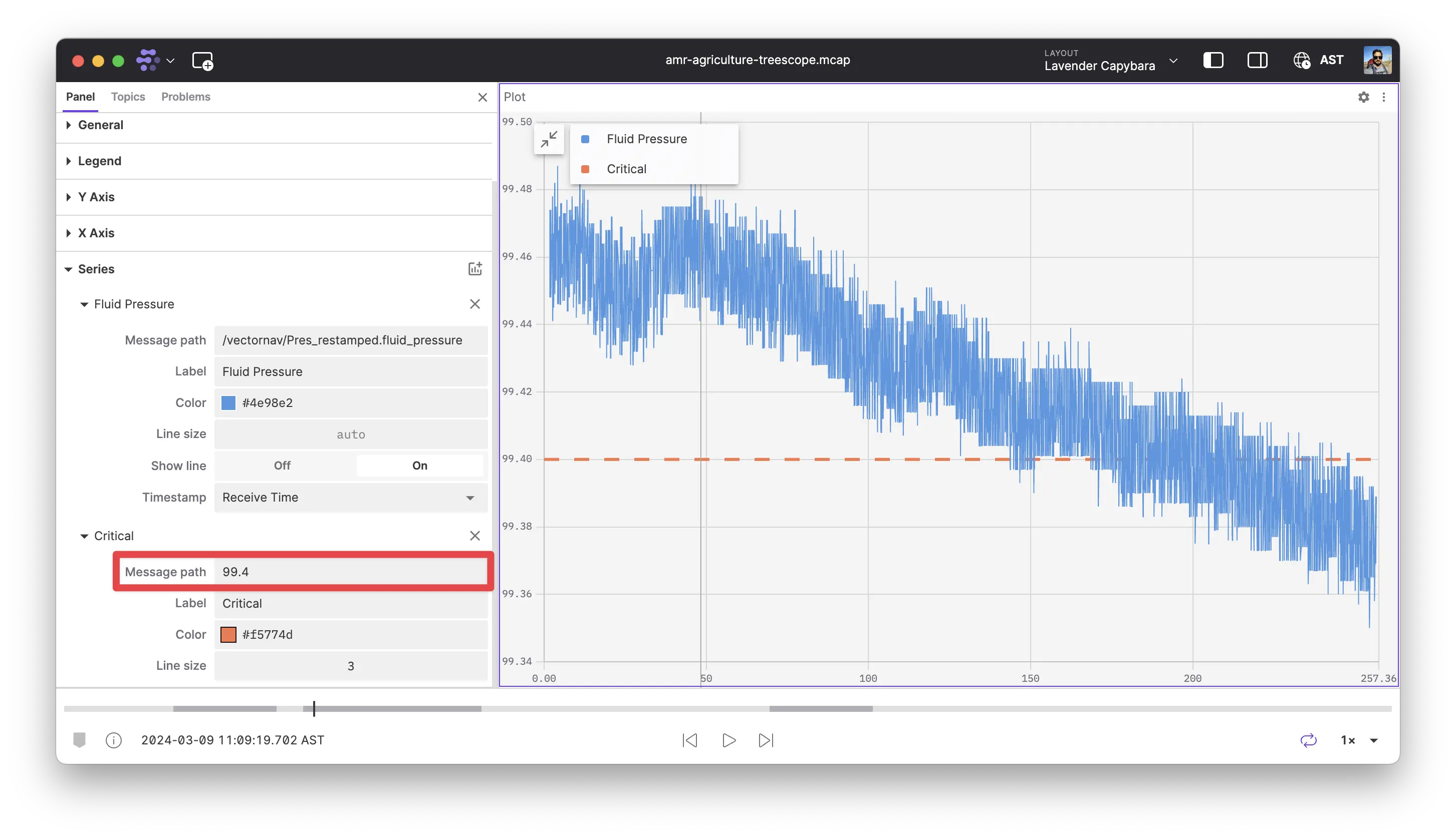
To add a reference line at a constant value in a plot panel, add a series and set the message path to the constant value you would like plotted.
Downsampling
To improve performance, the Plot panel will downsample data when points are too dense to meaningfully display.
Times series plots
In timestamp mode, the Plot panel will downsample data using a min/max/first/last downsampling algorithm. This downsampling will preserve extremes so even when downsampled, the plot will still show the highest and lowest values for each time period. The points kept during downsampling will always be from the original data — downsampling does not interpolate or create new points.
When data is downsampled, the Plot panel will automatically hide the dots for your data and only show lines. You can zoom until you see dots indicating you are seeing the full original data.
XY plots
In path-based modes, the Plot panel will use different downsampling approaches depending on the "Show lines" setting for the series.
If the series does not have lines enabled, downsampling will remove points which occur at the same pixel location as other points. The rendered plot will look the same as one with no downsampling.
If the series has lines enabled, downsampling will preserve the shape of the data and only remove points which would not alter the shape. When data is downsampled, the Plot panel will automatically hide the dots for your data and only show lines. You can zoom until you see dots indicating you are seeing the full original data.
Dynamic series
When a plot series' y-value path resolves to an array of objects, the Plot panel can render one independent sub-series per distinct label. Each array element supplies a label (the sub-series name) and a value (the y-value to plot). By default the panel reads label and value on each object. Use Label field and Value field in the series settings when your message uses different field names — for example, KeyValuePair messages with key and value.
This is useful when a producer publishes a dynamic set of named numeric values on a single topic — each label becomes its own line in the chart, the panel's legend, and the hover tooltip.
Label and value fields
Label field and Value field appear directly below Y-value path when the path uses a slice operator over an array. Leave either field empty to use the default (label or value).
Each array element must include both configured fields. The label field identifies the sub-series; the value field must resolve to a plottable numeric value. Elements with a missing or empty label are skipped.
Example: for messages shaped like { key: "temperature", value: 42.5 }, set Label field to key and leave Value field empty (or set it to value).
Accepted paths
To opt into dynamic sub-series, the y-value path must use a slice operator ([:], [2:], [1:5], [4], …) over an array whose items include the configured label and value fields:
/topic.object_array[:]— explicit multi-value slice over the array./topic.array[:].object— slice combined with object-field access.
If the message data does not match the configured fields, the series falls back to static plotting.
Color and label
Sub-series colors are deterministic by label: the same label always renders in the same color regardless of the order it first appears or which parent path it belongs to. Two parent paths that both produce a temperature sub-series render those sub-series in matching colors.
In the legend each sub-series row shows the dynamic label as its primary text and the parent path (or the parent's settings label, when set) in parentheses. Sub-series rows have no individual visibility checkbox or delete button — visibility is controlled by the parent's checkbox, and removing the parent removes all of its sub-series.
Limitations
- Dynamic series are supported in timestamp plots only.
Array indexandMessage path(XY) plots do not detect dynamic series. - Dynamic series are not compatible with the
@derivative,@delta, and@timedeltaspecial functions; those operate on numeric scalars, so paths that combine them fall back to static plotting. - Each parent path is capped at 100 distinct sub-series. If a producer emits more than 100 unique labels the additional labels are dropped and the parent series is flagged with a warning on the series in the settings sidebar.
CSV export
When you export plot data with dynamic series, each sub-series row in the CSV uses ${label} (${parentLabelOrPath}) in the topic column. parentLabelOrPath is the parent series' settings label when set, otherwise the parent's message path. Static rows keep the existing ${messagePath} format.